- Category:
- Workflow Tips
- Summary:
- Use the Adobe Color Wheel to create harmonious, accessible palettes with seven harmony rules, contrast checking, and color blindness simulation—all for free.
The Adobe Color Wheel at color.adobe.com/create/color-wheel is a free web-based tool that generates 5-color palettes using harmony rules, includes a contrast checker and color blindness simulator, and saves directly to Creative Cloud libraries. It works without a subscription for basic palette creation, though premium Adobe Express features like Brand Kits require a paid plan.
What the Adobe Color Wheel Actually Costs — Free vs Paid
Many sources describe the Adobe Color Wheel as a free tool, and that is accurate for the core experience. The color wheel generator itself, located at color.adobe.com/create/color-wheel, does not require any subscription or payment to use. You can select a base color, apply harmony rules, generate 5-color palettes, run the contrast checker, and use the color blindness simulator without spending anything. No Adobe ID is even required to access the wheel, though saving palettes does require a free Adobe account.
The boundary between free and paid lies in premium Adobe Express workflows. Saving a palette to a "Brand Kit" and automatically applying it across designs in Adobe Express requires a paid subscription. The table below clarifies what is available at no cost versus what requires a plan.
| Feature | Free | Paid / Premium |
|---|---|---|
| Color wheel generator | ✓ Full access | — |
| Color harmony rules (all 7) | ✓ Full access | — |
| Contrast checker (WCAG) | ✓ Full access | — |
| Color blindness simulator | ✓ Full access | — |
| Extract palette from image | ✓ Full access | — |
| Save to Creative Cloud library | ✓ (free account required) | — |
| Save to Brand Kit (Adobe Express) | — | ✓ Requires subscription |
| Auto-apply palettes in Adobe Express | — | ✓ Requires subscription |
As one Reddit user noted, the tool is "free to use without a subscription" for the core functionality. The paid tier only matters if you rely on Adobe Express's Brand Kit and automated on-brand workflows.
How to Access the Adobe Color Wheel Tool
The Adobe Color Wheel lives at color.adobe.com/create/color-wheel. It is a fully web-based interactive tool — there is no download, no installation, and no app to open. You can use it in any modern browser: Chrome, Firefox, Safari, and Edge all work well.
You do not need an Adobe account to use the wheel itself. An account is only required if you want to save palettes to Creative Cloud libraries for use in Photoshop, Illustrator, or Adobe Express. The tool works on mobile browsers too, though the interface is optimised for desktop screens.

The Adobe Color Wheel interface — a circular gradient lets you pick a base colour, then the tool generates a full palette around it.
Once you land on the page, you will see a circular color wheel on the left and a set of color swatches on the right. The wheel is interactive: clicking anywhere on it selects a new base color, and the swatches update in real time based on the harmony rule you have chosen.
The Seven Color Harmony Rules and How to Choose One
At the heart of the Adobe Color Wheel is its ability to apply color harmony rules. When you select a base color and pick a rule, the tool automatically generates a 5-color palette based on established color theory relationships. Each rule produces a different visual feel and serves a different design purpose.
Below are all seven harmony rules available in the tool, with guidance on when to use each one. After creating a palette with any rule, it is wise to test it with the color blindness simulator — a step that is often skipped but can save significant rework later.
Monochromatic Uses a single hue with variations in saturation and brightness. Creates calm, cohesive looks with a strong unified feel. Best for trust-focused brands — a blue monochromatic palette works well for finance, healthcare, or legal services.
Analogous Uses colors adjacent on the wheel. Produces harmonious, low-contrast palettes that feel natural and comfortable. Ideal for nature-themed designs — greens, teals, and yellows mimic outdoor environments.
Complementary Selects colors opposite each other on the wheel. Delivers high contrast and vibrant energy. Excellent for call-to-action buttons — blue and orange is a classic high-contrast pair.
Split Complementary Takes one color plus the two colors adjacent to its complement. Offers strong contrast with less tension than pure complementary. Works well for designs that need contrast without visual harshness, such as editorial layouts.
Triadic Spreads three colors evenly around the wheel (120° apart). Provides balanced variety while keeping harmony. A strong choice for playful, energetic designs — think children's products or event branding.
Tetradic (Double Complementary) Forms two complementary pairs for four colors total. Very rich and expressive, but requires careful balancing to avoid visual chaos. Suited to elaborate illustrations, diverse brand systems, or projects needing a wide color range.
Square Similar to tetradic but with four evenly spaced colors (90° apart). Creates complex, vibrant palettes with balanced variety. Works well for complex, multi-element designs where no single color dominates.
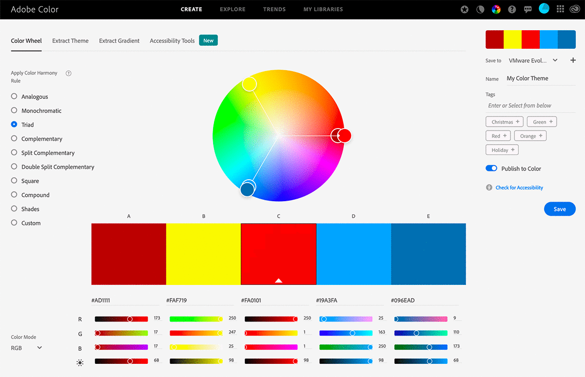
A Triadic harmony selected in the Adobe Color Wheel — the three evenly spaced colours appear on the wheel, with five swatches (including variations) displayed below along with their RGB and hex values.
Practical tip: After you settle on a harmony rule, toggle through each color blindness mode in the simulator panel (Protanopia, Deuteranopia, Tritanopia, Achromatopsia). If the palette loses contrast or certain colours become indistinguishable, adjust saturation or brightness before finalising. This single habit improves accessibility dramatically.
Step-by-Step: Using the Contrast Checker to Meet Accessibility Standards
The Adobe Color Wheel includes a built-in contrast checker that evaluates foreground/background colour pairs against WCAG (Web Content Accessibility Guidelines) standards. This is a critical step for any palette intended for web or UI design.
Here is how to use it:
- Open the contrast checker panel inside the Adobe Color Wheel interface — it is accessible from the control area below the color wheel.
- Select a foreground colour (typically text) and a background colour (a swatch from your palette). The tool displays the contrast ratio between them.
- Check the results against WCAG thresholds: AA compliance requires a minimum ratio of 4.5:1 for normal text, while AAA compliance requires 7:1. Large text (24px+ or bold 19px+) can pass AA at 3:1.
- Adjust colours if the ratio falls short — darken the text colour or lighten the background until the tool shows a pass.
Example: Light blue #A0C4FF on white #FFFFFF — contrast ratio approximately 1.6:1. Fails AA and AAA. Darken the blue or use a different background to meet the 4.5:1 threshold.
Accessibility-first workflow
Before saving any palette, run every text-against-background pair through the contrast checker. A palette that looks beautiful in the swatch view may fail badly when applied to a real interface. The contrast checker is not an afterthought — it is a core part of the palette creation process.
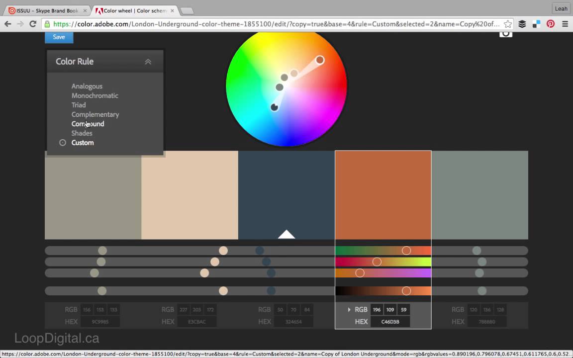
A custom palette in Adobe Color with five swatches — the contrast checker and colour blindness simulator are just a click away from this view.
How to Create a Palette from an Image Using Adobe Color
Beyond the color wheel, Adobe Color offers a practical image-based palette generator at color.adobe.com/create/image. Upload any photo, and the tool extracts 3–5 dominant colours that you can use as the foundation for a new palette.
How it works:
- Go to
color.adobe.com/create/imageand upload a photograph (JPG, PNG, or supported format). - The tool analyses the image and displays the dominant colours as swatches with their hex codes.
- Use the extracted swatches as a starting point — fine-tune them on the color wheel and run them through the contrast checker before finalising.
Practical scenario: You are designing a brand identity for a coffee shop. Upload a photo of roasted coffee beans. The tool returns warm browns, deep chocolates, and cream tones. Use those as your core palette, then refine with the color wheel and test for accessibility.
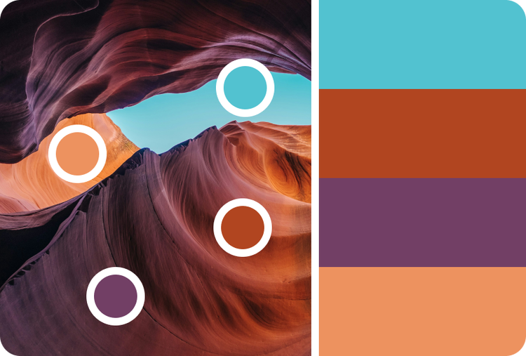
An Antelope Canyon photo with a four-color palette extracted automatically — the tool surfaces the dominant hues that define the image.
How to Save and Export Your Palette
Saving to Creative Cloud Libraries
Once you have a palette you like, click the "Save" button in the Adobe Color Wheel interface. Name the palette and choose or create a Creative Cloud library. The palette then appears automatically in Photoshop, Illustrator, and Adobe Express — as long as you are logged in with the correct Adobe ID.
Important: If your saved palettes do not show up in your apps, verify you are logged into the same Adobe ID across all tools. This is a common oversight that causes confusion. (See the Troubleshooting section below for a full fix.)
Exporting as an .ASE File for Non-Adobe Software
Adobe Color allows you to download your palette as an .ASE (Adobe Swatch Exchange) file. This is a standard format that can be imported into many design tools beyond the Adobe ecosystem:
- Affinity Designer and Affinity Photo — use the Swatches panel to import .ASE files.
- Procreate — .ASE files can be imported via the palette menu.
- Web development — convert .ASE colours to CSS custom properties or variables for use in a codebase.
Free vs Paid Saving Options
Basic saving to a Creative Cloud library is free with an Adobe account. However, saving to a Brand Kit or using the auto-apply feature in Adobe Express's premium workflow requires a paid subscription. Evaluate whether you need those features before committing to a plan.
Troubleshooting Common Adobe Color Wheel Problems
Users on the Adobe Community forums have reported several recurring issues with the Color Wheel tool. Below are the most common problems and the steps that resolve them.
The "Lost Circle" Bug — Selector Circle Not Draggable
Symptom: The selector circle moves outside the colour wheel, the interface becomes grayed out, and the circle cannot be dragged back to the wheel. This appears to be a UI rendering glitch that some users have been unable to resolve through normal browser use.
Fixes to try:
- Hard refresh the page —
Ctrl+F5on Windows orCmd+Shift+Ron Mac. - Disable browser extensions — ad-blockers, privacy plugins, and script blockers can interfere with the tool's JavaScript.
- Open the tool in an incognito/private window to rule out cached scripts or extension conflicts.
- Update your browser to the latest version.
- Try a different browser entirely — if Chrome fails, test Firefox or Edge.
The Adobe Community topic for this bug was closed without an official resolution, so if none of the above work, consider using the tool in a different browser as a workaround.
Missing Saved Palettes — Colors Not Showing in Libraries
Symptom: Color themes that were saved to Creative Cloud libraries do not appear in Photoshop, Illustrator, or the Adobe Color library view.
Cause: A performance update on August 26, 2020 changed how libraries load — palettes are still saved, but the cache may not display them immediately. This issue was documented by Adobe Community support staff.
Official fixes:
- Refresh the page and wait a few seconds for the cache to rebuild.
- Click "Load More" on the libraries page to fetch additional items.
- Click "Show More" inside a specific library folder to expand its contents.
- Verify your Adobe ID — ensure you are logged in with the same account used when saving the palette.
The "Grayed Out" Interface — Entire Page Unresponsive
Symptom: The entire Adobe Color page becomes unresponsive, with most controls grayed out. This may occur alongside the "Lost Circle" bug or independently.
Fixes to try:
- Hard refresh the page (
Ctrl+F5/Cmd+Shift+R). - Disable ad-blocker and script-blocking extensions temporarily.
- Open the tool in a private browsing session to isolate extension interference.
- If the issue persists, switch to a different browser or device.
Note on unresolved issues
The "Lost Circle" bug and "Grayed Out" interface problems were reported in the Adobe Community and the official topics were closed without a permanent fix. If you encounter these issues, the steps above are the best currently available workarounds.
Using the Color Blindness Simulator to Design for Everyone
The Adobe Color Wheel includes a color blindness simulator that shows how your palette looks to people with different types of colour vision deficiencies. This is a critical accessibility tool that should be part of every palette creation workflow.
How to use it:
- Open the simulator from the tool's interface (typically a small eye icon or dropdown labelled "Color Blindness").
- Select a deficiency type to preview: Protanopia (reduced red sensitivity), Deuteranopia (reduced green sensitivity), Tritanopia (reduced blue sensitivity), or Achromatopsia (complete loss of colour perception).
- The tool redraws the palette as it would appear under that condition. If contrast collapses or colours become indistinguishable, adjust saturation or brightness.
Combined workflow with the contrast checker: A palette that passes AA under normal vision may fail under a color blindness simulation. After creating your palette, toggle through each deficiency mode. If a pair of colours that looked distinct becomes essentially identical, adjust one of them. Then re-check the contrast ratio. This combined approach ensures your palette works for the widest possible audience.
What to Do Next — Apply Your Palette in a Real Project
Once your palette is saved to Creative Cloud, it becomes available in Photoshop, Illustrator, and Adobe Express automatically. Here is a concrete next step to validate your palette in a real design context:
- Open Photoshop or Illustrator — your saved palette appears in the Swatches panel under the library name.
- Create a simple mockup — a landing page with a heading, body text, a button, and a background. Apply colours from your palette to each element.
- Run a final contrast check — use the built-in contrast checker on every text-against-background pair in your mockup.
- Share with your team — Creative Cloud shared libraries allow collaborators to access the same palette instantly.
For a more thorough walkthrough, the "How to use Adobe Color" tutorial from UT San Antonio Academic Innovation provides a visual guide to the entire process from wheel to finished design.
One last check
Before calling a palette finished, run it through the color blindness simulator one more time with all four deficiency modes. Then verify that your most important text-background pairs pass at least WCAG AA (4.5:1). A palette that looks great in the swatch view but fails in application is not finished — it is a starting point.