- Category:
- Workflow Tips
- Summary:
- Learn what a user interface is, explore its key types (CLI, GUI, touch, and voice), and understand its impact on human-computer interaction.
A user interface (UI) is the space where a human and a machine interact — the visible and interactive layer of software and hardware that translates user actions into system responses. It includes screens, buttons, icons, keyboard shortcuts, voice commands, touch gestures, and any other means of controlling a digital system. UI is what you see and touch; it is the bridge between the person and the underlying code.
Define What a User Interface Is — and What It Isn't
Before exploring the visual polish or the technical wiring, it helps to get the boundaries right. A user interface covers both hardware (mouse, keyboard, touchscreen) and software (windows, icons, menus, voice prompts). It is not the same as user experience (UX), which encompasses the entire emotional and practical journey a person has with a product. UI is the tangible surface of that journey — the controls and displays a person directly engages with.
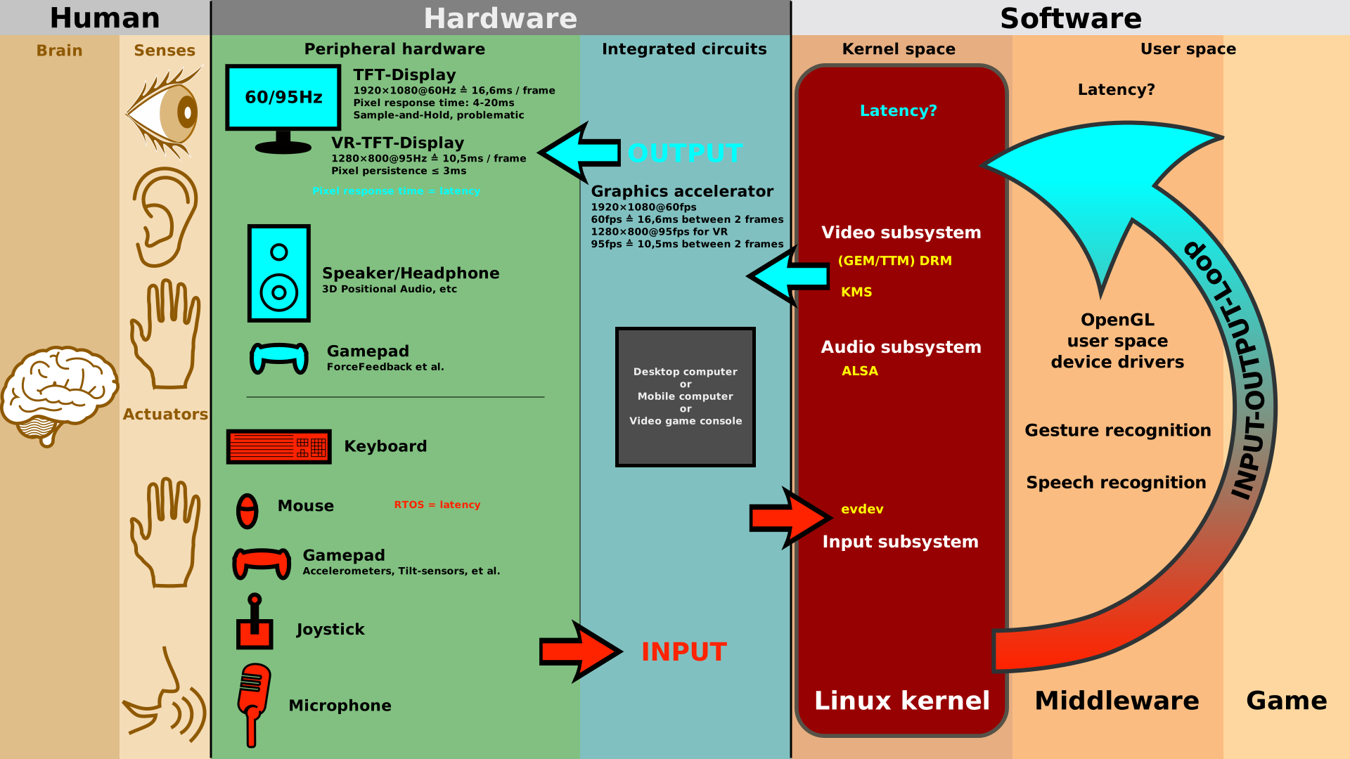
A user interface completes an input-output loop: the human sends a command, the system processes it and returns feedback.
Core Definitions from Industry Sources
Several authoritative sources agree on the essence of a user interface, though each frames it slightly differently:
Wikipedia — "In the industrial design field of human–computer interaction, a user interface (UI) is the space where interactions between humans and machines occur." The goal is effective operation and control, with feedback that aids decision-making. Wikipedia — User interface
Simpplr — "A user interface (UI) is the point of interaction between a user and a digital product, such as a website, application or software. It's the space where humans and technology meet." Simpplr — What is UI?
TechTarget — "The user interface (UI) is the point of human-computer interaction and communication in a device. This can include display screens, keyboards, a mouse and the appearance of a desktop." TechTarget — What Is a UI?
Maple Systems — "The user interface or UI is the means by which a user and a computer interact. UIs are usually made up of visual and audio elements, such as icons, buttons, sound, text, and graphics on a display screen." Maple Systems — What is a UI?
A fifth perspective comes from software methodology expert Ambysoft, which states bluntly: "A fundamental reality of application development is that the user interface is the system to the users." In other words, for most people, the UI is the application — they never see the database, the API, or the business logic. Only the interface. (Ambysoft)
Across all five sources, the common thread is clear: UI is the interaction space between a human and a machine, comprising whatever sensory channels — visual, auditory, tactile — the device uses to receive commands and deliver feedback.
A Brief History of User Interfaces
User interfaces have evolved dramatically since the early days of computing. The major milestones show a steady progression toward more intuitive, accessible interaction models.
- 1960s Command-Line Interface (CLI) — Users typed text commands into a terminal. Powerful for experts but required memorisation of syntax. Used on systems like UNIX and early IBM mainframes.
- 1980s First Graphical User Interface (GUI) — Xerox PARC introduced the Xerox Star, the first commercial GUI with windows, icons, menus, and a pointer. Apple and Microsoft later popularised the paradigm with the Macintosh and Windows.
- 2000s–2010s Touch, Voice & Mobile — Smartphones (iPhone, Android) replaced physical keyboards with touchscreens. Voice assistants (Siri, Alexa) added conversational interaction. Gesture-based and multimodal interfaces emerged.
- 2020s onward AR, VR & Brain-Computer Interfaces — Augmented and virtual reality introduce spatial, three-dimensional UIs. Experimental BCIs aim to let users control systems with neural signals alone. (Wikipedia)
Why this matters today: Each paradigm shift made computing available to a wider audience. The CLI demanded technical literacy; the GUI opened computers to office workers and the general public; touch and voice made them usable on the move. Understanding this arc helps designers choose the right interface style for their users' context.
How UI Differs from UX

UX covers the full journey (research, structure, testing); UI focuses on the visual and interactive surface.
A common source of confusion is the line between UI and UX. User experience (UX) is the complete end-to-end journey a person has with a product — how they feel when they first hear about it, how easy it is to sign up, how well the product solves their problem, and what they think after using it. User interface (UI) is the visual and interactive layer they touch along that journey.
As TechTarget notes, UI design "requires knowledge about user interaction design patterns and accessibility to ensure interfaces are user-friendly." (TechTarget) This is the craft of making the surface layer both usable and attractive. UX, by contrast, involves research, information architecture, usability testing, and content strategy — work that happens before the first pixel is drawn.
In short: UI is the bridge; UX is the entire journey across and beyond that bridge. A beautiful UI cannot rescue a product with a broken workflow, and a well-researched UX can be undermined by a cluttered, inconsistent interface.
Identify the Major Types of User Interfaces
User interfaces come in many forms, each suited to different tasks, environments, and user skill levels. The table below maps the most common types against their typical use cases.
| Type | Definition | Examples | Best suited for |
|---|---|---|---|
| Graphical (GUI) | Visual interface using windows, icons, menus, and a pointing device. The most common UI type today. | Windows, macOS, Android, iOS, web apps | General consumers, productivity, creative work |
| Command-Line (CLI) | Text-based interaction where users type commands. No graphics — fast and scriptable. | Terminal, PowerShell, bash, SSH | Developers, system administrators, power users |
| Voice (VUI) / Natural Language | Speech-driven interaction. Natural language UI accepts conversational text or voice input; distinct from a "natural user interface" that minimises learning curve. | Siri, Alexa, Google Assistant, ChatGPT | Hands-free tasks, accessibility, quick queries |
| Touch / Gesture | Direct manipulation via touch, swipe, pinch, and other gestures on a sensitive surface. | Smartphone screens, tablets, kiosks, ATM touchscreens | Mobile devices, public terminals, in-car infotainment |
| Menu-Driven | Hierarchical menus guide the user through choices. Minimal typing required. | ATM machines, old mobile phones, point-of-sale systems | Simple, structured tasks; walk-up-and-use scenarios |
| Form-Based | Data entry through labelled fields, checkboxes, dropdowns, and buttons. | Registration pages, survey tools, booking forms | Structured data collection, e‑commerce checkout |
| Brain-Computer (BCI) | Direct neural communication — brain signals control the system without physical movement. | Medical prosthetics, experimental communication aids | Accessibility, medical rehabilitation, research |
| Composite / Multimodal | Combines two or more sensory modalities (visual + audio + touch) for richer interaction. | VR headsets, AR glasses, multimedia kiosks | Immersive experiences, training simulations, data visualisation |
Note on terminology: TechTarget explicitly distinguishes natural language UI (you speak or type naturally) from a natural user interface (an interface that feels intuitive, often gesture- or touch-based). (TechTarget) Both are valid, but they serve different design goals.
Graphical User Interfaces (GUI)
The GUI is the dominant interface paradigm of the last four decades. As The Designership notes, "The most common user interface is the Graphical User Interface (GUI). GUIs are all around us." (The Designership) From a laptop's desktop to a mobile app's home screen, the GUI uses spatial layout, colour, typography, and direct manipulation (click, drag, tap) to let users control the system with minimal training.
Command-Line Interfaces (CLI)
Before the GUI, the CLI was the standard. It remains essential for developers and system administrators who need precision and automation. A CLI can be faster than a GUI for repetitive tasks, but it requires the user to know the exact command syntax. (Wikipedia)
Voice User Interfaces (VUI) and Natural Language UI
Voice interfaces let users speak commands — "Set a timer for ten minutes" or "Play jazz in the living room." Natural language UI extends the concept to text-based conversational systems (chatbots, AI assistants). Both are seeing rapid adoption as speech recognition accuracy improves. (Simpplr)
Other Specialized Interfaces
Beyond the major categories, specialised interfaces serve niche but crucial roles: touch interfaces power nearly every smartphone; menu-driven interfaces guide users through ATMs and self-checkout kiosks; brain-computer interfaces (BCI) are opening communication channels for people with severe motor impairments. Wikipedia also notes sensory-based UI categories — tactile, auditory, olfactory, equilibria (balance), and gustatory — most of which remain experimental outside of VR and research labs. (Wikipedia)
Examine the Key Elements of a User Interface
Every UI, regardless of its type, is built from a set of reusable components. Understanding these elements helps designers create interfaces that are both functional and visually coherent.
Simpplr groups UI elements into four high-level categories: typography, colour schemes, interactive elements, and visual hierarchy. (Simpplr) TechTarget adds more concrete examples: type fonts, icons, buttons, animations, and sounds. (TechTarget) Community discussions on Reddit also mention layout, links, toolbars, and icons as fundamental building blocks.
Here are the essential UI elements every designer works with:
- Layout — the spatial arrangement of content. A clear layout establishes visual hierarchy and guides the eye from most important to least important elements.
- Typography — font choices, sizes, weights, and spacing affect readability and tone. A UI with poor typography feels amateurish and strains the reader.
- Colour — used for branding, emphasis, state indication (error red, success green), and accessibility. Colour must meet contrast ratios for text legibility.
- Icons & Buttons — affordances that signal action. Buttons should look clickable; icons should carry intuitive meanings (a magnifying glass for search).
- Forms & Input Fields — the primary way users enter data. Labels, placeholders, validation messages, and error states are all part of the UI.
- Animations & Transitions — subtle motion (a button depress, a page slide) provides feedback and makes the interface feel responsive.
- Sounds & Haptics — audio cues (notification chimes) and vibration patterns add a secondary channel of feedback, especially important in mobile and accessibility contexts.
Rule of thumb: Every element should serve a purpose. If a component does not help the user complete a task or understand the system, consider removing it. A clean, focused interface reduces cognitive load.
Learn How to Design a User Interface Step by Step
Designing a user interface is a structured process that moves from understanding the user to producing pixel-perfect screens. The workflow described by TechTarget provides a solid foundation, extended here with principles from Ambysoft and The Designership. (TechTarget)
Assess User Needs and Existing Features
Before opening any design tool, invest time in user research. Identify who will use the interface, what tasks they need to accomplish, and what environment they will be in. Audit any existing interface to catalogue what works and what causes friction. Competitor analysis can reveal common patterns and opportunities for improvement.
Sketch and Wireframe Your Ideas
Start with low-fidelity sketches on paper or a whiteboard — fast, cheap, and easy to revise. Next, build wireframes: black-and-white layouts that define the placement of elements without visual styling. Wireframes focus on structure and flow, not on colours or fonts. Finally, create high-fidelity mockups with the actual typography, colour palette, icons, and content.
Apply Core Design Principles
Ambysoft provides a set of practical design rules that apply across interface types: (Ambysoft)
- Consistency — similar actions should work the same way everywhere in the interface. Use the same visual style for buttons, the same placement for navigation, and the same terminology throughout.
- Set standards — follow platform conventions (e.g., Microsoft's design guidelines for Windows, Apple's Human Interface Guidelines for iOS). Users bring expectations from other apps; meeting those expectations reduces learning time.
- Hold the line — resist the urge to add "just one more" feature to a screen. A focused interface is easier to learn and less error-prone.
- Explain the rules — use labels, tooltips, and help text to clarify what each control does. Do not make the user guess.
- Navigation flow — in Western cultures, users scan left-to-right, top-to-bottom. Place primary actions and key information accordingly.
Design for Different User Roles
The Designership emphasises that a single interface often serves multiple types of users: (The Designership)
- First-time users need onboarding, clear labels, and guided workflows (e.g., Uber Eats walks new users through ordering step by step).
- Repeat users benefit from shortcuts, saved preferences, and streamlined flows for frequent tasks.
- Super users — often administrators or power users — need advanced controls, bulk actions, and keyboard shortcuts that skip the visual interface entirely.
Designing for all three groups means layering the interface: simple by default, with progressive disclosure that reveals more power as the user's expertise grows.
Understand Why a Good User Interface Matters
The quality of a user interface directly affects business metrics and user satisfaction. Research from Forrester and Nielsen Norman Group quantifies the impact, while practitioner accounts describe the operational benefits.
Conversion and Usability Stats
200% Increase in conversion rate — Forrester Research 83% Improvement in conversions — NN/g (great usability) 75% Higher task completion rate — NN/g 20% Reduction in cart abandonment — NN/g
According to Simpplr, "A well-designed user interface can increase website conversion rates by up to 200% (Forrester Research)." (Simpplr) The Designership cites additional data from the Nielsen Norman Group: interfaces with strong usability improve conversions by 83%, task completion rates by 75%, and reduce cart abandonment by 20%. (The Designership)
Business Benefits: Reduced Costs and Higher Productivity
Beyond conversion metrics, a well-crafted UI reduces operational costs. Simpplr notes that good UI boosts employee engagement, reduces training time, minimises errors, and enhances productivity. (Simpplr) Ambysoft adds that "the more intuitive the user interface, the easier it is to use, and the easier it is to use, the less expensive it is to use" — training costs drop, support tickets decrease, and user satisfaction rises. (Ambysoft)
In enterprise settings, these savings compound. A UI that reduces data-entry errors by even a few percentage points can save thousands of hours of rework. An interface that eliminates a single repetitive step for a large team can return the design investment within weeks.
Avoid Common UI Pitfalls with Real-World Lessons
Theoretical principles are valuable, but real-world failures show what happens when they are ignored. Community forums like the Atlassian Community and DaniWeb document specific breakdowns that offer concrete lessons for designers.
Case Study: UI Updates That Broke Workflows (Atlassian)
Atlassian — Login Flow Disruption Users reported that a UI update removed direct login access, requiring extra clicks to reach authentication. A previously unchecked "Remember me" preference defaulted to unchecked, forcing repeated logins. Cross-tool autolinking between Jira and Confluence stopped working, breaking team workflows. (Atlassian Community) Source: Atlassian Community discussion
DaniWeb — Tension Between Delight & Usability Practitioners on DaniWeb described interfaces that prioritised visual "delight" over basic usability: cookie consent banners that obscure content, slow mobile performance, confusing navigation hierarchies, long forms with unclear progress, weak call-to-action placement, and checkout friction that caused abandonment. (DaniWeb) Source: DaniWeb UI/UX Design forum
Good UI Example: Airbnb, Dropbox TechTarget cites Airbnb and Dropbox as examples of strong UI design. Both use clear visual hierarchy, fast performance, predictable navigation, and smart defaults (e.g., remembering previous searches). (TechTarget) Their interfaces fade into the background, letting users focus on their goals — booking a stay or sharing a file. Source: TechTarget
Real Developer Complaints About Bad UI (DaniWeb)
The DaniWeb community UX audit identified several recurring issues that directly echo the design principles above:
- Slow mobile performance — assets not optimised for smaller screens, leading to lag and high data usage.
- Confusing navigation — menus with too many levels, inconsistent labels, and no breadcrumb trails.
- Long, unsegmented forms — single-page forms that should have been split into steps with progress indicators.
- Weak CTAs — action buttons that blend into the background or use ambiguous wording ("Submit" instead of "Book now").
- Checkout friction — requiring account creation before purchase, hidden fees, and unclear error messages.
Lesson: Every one of these issues has a known fix — performance budgets, card-sorting for navigation, progressive disclosure for forms, contrast-rich buttons, and guest checkout options. The gap is not knowledge; it is prioritisation during development.
Examples of Good UI Design (Airbnb, Dropbox)
In contrast to the failures, TechTarget highlights Airbnb and Dropbox as examples of UI done well. Both apply the principles from earlier sections: consistent layout, clear visual hierarchy, fast load times, and smart defaults that reduce friction. Dropbox, for instance, uses a clean, uncluttered interface with prominent action buttons (Upload, Share) and a predictable folder structure. Airbnb's search-and-book flow guides the user through a logical sequence — location, dates, filters, selection, payment — with clear progress and minimal surprises. (TechTarget)
Bottom line: The difference between a frustrating UI and a great one often comes down to small, deliberate choices — a well-placed button, a helpful error message, a remembered preference. These details accumulate into an interface that respects the user's time and attention.